
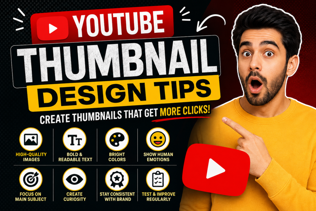
A YouTube thumbnail is the first thing viewers notice before clicking on your video. Even if your content is excellent, a poor thumbnail can reduce your click-through rate (CTR). On the other hand, a well-designed thumbnail grabs attention and encourages people to watch your video.
In this guide, you’ll learn practical YouTube thumbnail design tips that help increase views, improve engagement, and build a professional-looking YouTube channel.
Why Are YouTube Thumbnails Important?
A thumbnail acts like a book cover. It gives viewers an idea of what the video is about before they click.
Benefits of a good thumbnail include:
- Higher click-through rate (CTR)
- More video views
- Better audience engagement
- Improved brand recognition
- Increased chances of appearing in YouTube recommendations
A great thumbnail doesn’t guarantee success, but it significantly improves your chances of getting noticed.
1. Use High-Quality Images
Always use clear and high-resolution images. Blurry or pixelated thumbnails make your content appear unprofessional.
Recommended size:
- 1280 × 720 pixels
- JPG or PNG format
- Less than 2 MB file size
- 16:9 aspect ratio
Sharp images help create a professional first impression.
2. Keep the Design Simple
Avoid adding too many elements to your thumbnail.
Instead, focus on:
- One main subject
- Clean background
- Short headline
- Balanced layout
Simple thumbnails are easier to understand, especially on mobile devices.
3. Use Bold and Readable Text
Many viewers watch YouTube on smartphones.
Use:
- Large font size
- Bold typography
- High contrast colors
- Maximum 3–6 words
Example:
Instead of:
“Complete Guide to Starting a Successful YouTube Channel in 2026”
Use:
Start YouTube Today!
Short text grabs attention faster.
4. Choose Bright Colors
Bright colors naturally attract attention.
Popular combinations include:
- Yellow & Black
- Red & White
- Blue & White
- Green & Black
Use contrasting colors so text stands out clearly.
5. Show Human Emotions
People connect with faces.
Use expressions like:
- Surprise
- Happiness
- Excitement
- Curiosity
- Shock
Emotional expressions often increase click-through rates because viewers become curious about the content.
6. Stay Consistent With Your Brand
If you upload videos regularly, maintain a consistent thumbnail style.
Include:
- Same fonts
- Similar colors
- Logo (optional)
- Consistent layout
This helps viewers recognize your videos instantly.
7. Create Curiosity Without Misleading
Your thumbnail should encourage curiosity but must accurately represent the video.
Avoid:
- Fake promises
- Misleading images
- Clickbait that disappoints viewers
Trust is more valuable than temporary clicks.
8. Highlight the Main Subject
The main object should be easy to identify.
Examples include:
- A product
- A person
- A laptop
- A mobile phone
- A camera
Reduce background distractions to keep focus on the main subject.
9. Add Visual Contrast
Contrast improves readability.
You can create contrast using:
- Dark background with light text
- Light background with dark text
- Borders
- Shadows
- Color overlays
These techniques help important elements stand out.
10. Test Different Thumbnail Designs
Don’t rely on one design forever.
Experiment with:
- Different colors
- Text styles
- Layouts
- Facial expressions
- Background images
Over time, you’ll understand what works best for your audience.
Common Thumbnail Mistakes
Avoid these common errors:
- Tiny text
- Low-quality images
- Too many design elements
- Misleading visuals
- Poor color combinations
- Cluttered layouts
- Excessive effects
Keeping your design clean usually performs better.
Best Tools for Designing YouTube Thumbnails
Several tools can help beginners create professional thumbnails.
Popular options include:
- Canva
- Adobe Express
- Figma
- Photoshop
- Pixlr
Choose the one that matches your skill level and workflow.